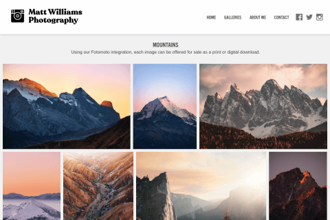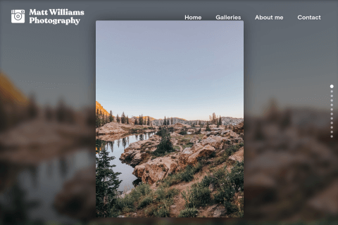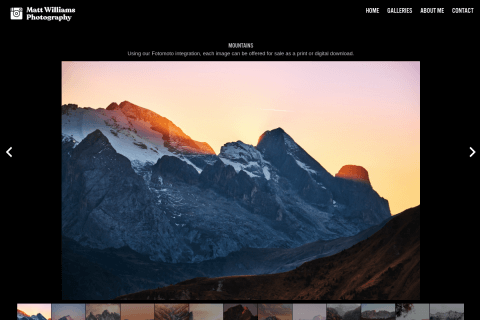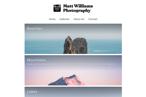
There are thousands of articles outlining the step-by-step process on how to create an online portfolio. Each article will stress various tactics to building a portfolio and they can be very detailed, but while the suggestions can be helpful, many of the steps aren't critical to getting your work online.
Ultimately what's important is that people see your work, interact with it, and get in touch with you. Here are a few points that will hopefully help you stand out when someone visits your portfolio.
Structuring your work for the “wow” factor and the tepid visitor
Attention spans of website visitors get shorter every decade. You only have a few seconds to catch someone’s eye.
As consumers, we are conditioned to not spend too much time on something until we find what we’re looking for. Subconsciously, we filter through websites until we land on something that catches our eye. This is especially true when a potential employer or client is browsing. If they’re visiting your portfolio, keep in mind there’s a good chance they just waded through 10 others.
Because of this, it’s important to assemble a portfolio that pops right from the beginning. We all have a hunch on which of our work is our best, so that work usually ends up right up front. But with this in mind, it’s also necessary to add variety. For example, if you have three really solid pieces of work using the same color scheme or demonstrating the same technique, perhaps shake things up by adding completely contrasted work in between. The variety will keep your visitors on their toes. Too much monotony and they might think this one particular thing is all you do, or all you have in your portfolio.
Keep in mind: you only have a few seconds to catch someone’s eye. If it helps, set a timer for 8 seconds and visit your own portfolio. See how much work you can cover in that amount of time. If you don’t get to the really good stuff, consider moving it closer to the top.
At the same time, including a project from start to finish isn’t a bad idea. It just needs to be presented tactfully. Make sure it isn’t the first thing your visitors will see, and when you include a start to finish project, be sure to start out with a preview of the completed project because it will be more eye-catching that the first draft.
Make it personal
Adding a human touch is important to make a connection. Your website should reflect who you are.
In a personal portfolio, it’s important to provide a little background about yourself. Don’t talk in the third person, don’t give your life story, but do share interesting facts that might resonate with whoever’s reading your bio. This will give your work more personality.
Keep in mind that on the other end of the computer is a person - with feelings and emotions. An overly professional-sounding bio might not connect. Third-person bios are best left to company bios. When a person is reading a third-person bio on a personal portfolio, they’ll know someone else didn’t write it, so don’t pretend like they did!
Keep things simple
Give your visitors a taste of what you can do, and encourage them to get in touch if they’d like to learn more.
Think of your portfolio as marketing for yourself. It shouldn’t be designed to cover every piece of work for every project you’ve ever worked on, along with the backstory about it all. Leave some conversation pieces off of your site. This will give you a great topic of discussion when you meet up with a potential employer face-to-face.
Another important factor is keeping the layout and structure simple. Sometimes a separate About and Contact page will only complicate things, just like having different links for “Home” and “Portfolio”.
After you’ve put together your portfolio, show it off to a few friends and ask for feedback before sharing it with potential employers. See if they can successfully navigate through it. Even write down a list of things you want to make sure your friends see, then check them off as you watch them peruse your portfolio. If they don’t hit the important parts, consider re-working it.
In summary…
A portfolio should be a reflection of you. The more your personality shines, the more likely it will connect with someone. As long as your portfolio shows a good variety, is easy to navigate and is well-laid out, you’ve got a good shot at connecting with the company or client who is looking for you!

