We all know it’s crucial to have an online portfolio. These days it’s rare to get hired for something creative without having a collection of work. But creating an online portfolio isn’t just about throwing stuff in a folder. There’s an important mix of content, design and structure that all play a part.
The following series of posts will walk you through various aspects of how to create an online portfolio, covering everything from the work you should highlight to the way it should be laid out. We'll even cover important tips to make you rise the ranks of search engines (also known as search engine optimization).
The first topic of this series is how to best choose and highlight work.
STRUCTURING YOUR CONTENT
Demonstrate a range of skills

When selecting work for your portfolio, it’s important to show a range of skills. Prospective customers or employers will often be attracted to a particular piece of work, but often times, what they like isn’t in the same ballpark as what they actually need. Providing examples on multiple ends of the spectrum can be beneficial to demonstrate you can not only produce high-quality work, but can also handle different types of work.
Organize folders by project or type

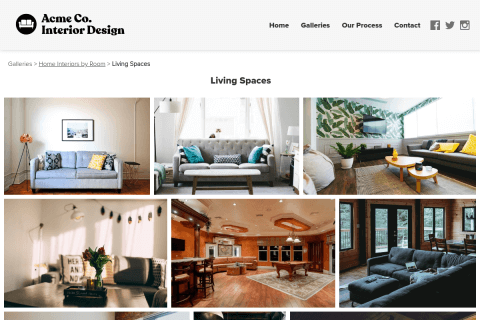
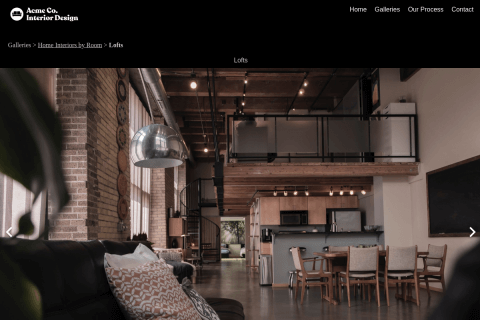
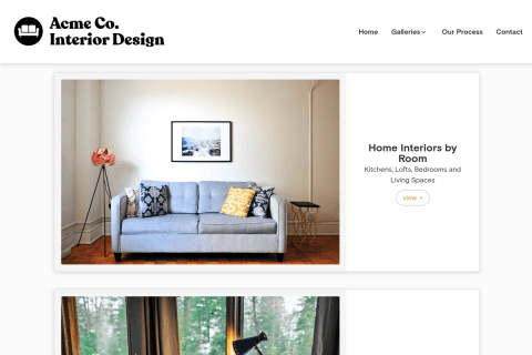
Online portfolio services offer the ability to separate work by folders. It’s important to use these properly. If your works spans multiple disciplines or genres, divvy up your work by that. This allows visitors to find something that appeals to them. They can always browse to other folders, but allowing people to quickly access exactly what they’re looking for increases the chance they’ll dive deeper into your portfolio.
Keep things interesting
Content should be concise enough to keep the visitor’s attention, yet verbose enough to get a particular point across. If there is too much overlap between pictures in a gallery - not enough difference for visitors to notice - they can begin to lose interest. Be sure to highlight interesting pieces that are different enough to keep someone engaged.
Keep it short and sweet… but not too short
We’ve found the ideal number of items in a folder is 10-20 pieces. Placing only one or two items in each folder can be frustrating for a visitor to navigate as they will have to keep returning to the homepage to switch folders. Adding the right number allows the visitor to get a good idea of the quality of your work. Of course, don’t overdo it either. Once you start adding 30+ images in a folder, it can verge on the side of overwhelming. If there are too many images, the chance a visitor seeing them all will decrease drastically. And on the technical front, things make take longer to load if you add too many items to a folder.
Choosing a good URL

Most online portfolio services will set you up with a username out of the gate. For example, my URL is http://watilo.foliohd.com (Watilo is my last name). I chose this because it’s consistent with my Twitter username, and it’s easily identifiable. (I don’t have a special company name or anything like that.) However if I did, I would stick with something generic to my craft. Since I’m in the field of web design, something like corywatilodesign.com might work. It wouldn’t benefit me to dovetail too deeply like corywatilophotoshopdesign.com or corywatilointerfacedesign.com. Narrowing the focus of my URL too much can pin me into a corner which might not be beneficial if I end up changing directions of my business down the road.
Another thing to consider is that shorter URLs are better. watilodesign.com is far superior to corywatilowebsitedesign.com. In addition to longer URLs being harder for people to type, they are also more challenging to read. Ideally look for a URL under 12 characters. If you decide to purchase a domain name, explore some alternate extensions like .net or .info if your desired .com is taken. (Oh by the way, NEVER pay more than $15 for a domain name. Some services charge upward of $30, but you can get the same service at a much lower rate.)
Recap
These are a few tips to optimize the structure and content of your portfolio. Keep in mind that what might be interesting to YOU might not be interesting to your visitors. Keep their best interest in mind and it will drastically improve your chance of sticking out to your prospective customers.
Next Up…
Our next post will focus on how to craft your content to pop.
Continue to: The secret web designers use for building successful portfolios
